Invisible AI: Mortgage Prequalification That Feels Human
Designing a white-labeled AI chatbot that lives on lender websites, builds trust from first contact through prequalification, preapproval, and the entire loan lifecycle — persisting as a guide inside the consumer portal until close.
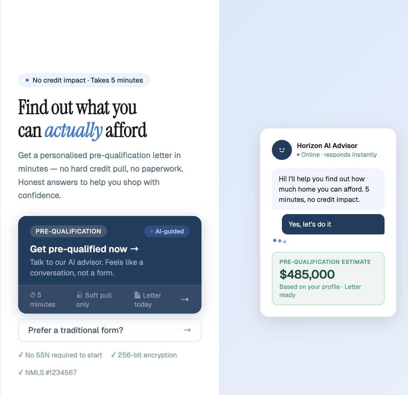
Fig 1 — Landing page with AI advisor chat widget and pre-qualification CTA
The Product
A white-labeled AI chatbot that enters on the lender's website and never leaves. It starts with prequalification — guiding borrowers through income, assets, and property questions in a conversational flow. Once prequalified, it transitions into preapproval, then persists inside the consumer portal as borrowers upload documents, track conditions, and move toward closing. The bot adapts to three personas — first-time homebuyers who need education, seasoned buyers who want speed, and people navigating the market who need confidence — building trust at every stage of the loan lifecycle.
The Design Problem
The core challenge isn't the AI — it's trust. A borrower lands on a lender's website already anxious about whether they'll qualify. If the chatbot feels like a form in disguise, they leave. If it feels like a sales pitch, they distrust it. The design problem spans three phases: earn trust fast enough to start prequal, maintain confidence through preapproval, and stay useful as a persistent guide through the loan lifecycle in the consumer portal.
Failure Modes
Bounced in 8 seconds: First-time buyer sees "prequalification" and doesn't know what it means or why they should trust a chatbot with financial info. No outcome stated. No trust signals. Tab closed.
Prequal completed, preapproval abandoned: Borrower got their letter but the transition to preapproval felt like starting over. No continuity. The bot didn't carry context forward, so trust reset to zero.
Borrower feels surveilled: Income and asset questions feel invasive without context. Mortgage jargon triggers anxiety. No explanation of why each piece of information is needed or how it helps them.
Ghost in the portal: After preapproval, the chatbot disappears from the consumer portal. Borrower is left navigating document uploads, condition tracking, and closing steps alone — exactly when they need guidance most.
Three Moments That Determine Everything
Every design decision maps back to one of three moments in the borrower's first encounter. Most lender websites obsess over the CTA and neglect what happens after the click. All three moments need to be designed as distinct, intentional experiences — because conversion to preapproval is determined by how the prequal ends, not how it begins.
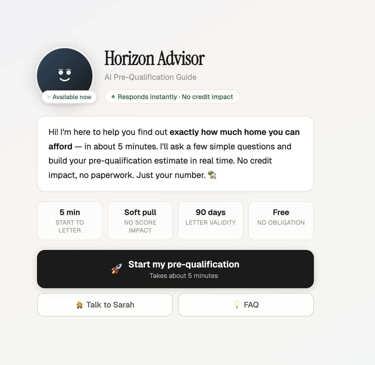
Fig 2 — The welcome screen: outcome stated before the process, trust signals front and center
The First Impression
The bot speaks first with the lender's voice and brand. The outcome — "Find out what you can actually afford" — is stated before a single question. Trust signals (encryption, no credit impact) visible immediately.
The Prequal Conversation
Every answer moves the progress bar toward their letter. The bot explains why each question matters. First-time buyers get contextual education. Seasoned buyers get a faster path. The borrower feels guided, not interrogated.
The Handoff to Engagement
The prequal letter is delivered with clear next steps. The bot introduces the loan officer by name, offers to schedule a call, and explains what preapproval unlocks. The relationship with the lender starts here — not at a cold form.
The Loan Lifecycle Arc
Build Trust & Qualify: Borrower enters from the lender's website. The bot adapts to their persona, walks them through income, assets, and property questions, and delivers a prequal letter with their estimated loan amount — all in a single conversational session.
Deepen the Relationship: The bot carries full context forward. "Based on your prequal, here's what we need for preapproval." It guides document collection, explains each requirement in plain language, and connects the borrower to their loan officer at the right moment.
Guide Through Close: Inside the consumer portal, the bot persists as a guide — answering questions about conditions, explaining what "clear to close" means, surfacing next steps proactively. The borrower never feels lost in the process because the same trusted voice is always available.
The Conversational Flow
Every interaction is designed to feel like a conversation, not a form. Adaptive questions, contextual education, and a progress bar that moves with each answer.
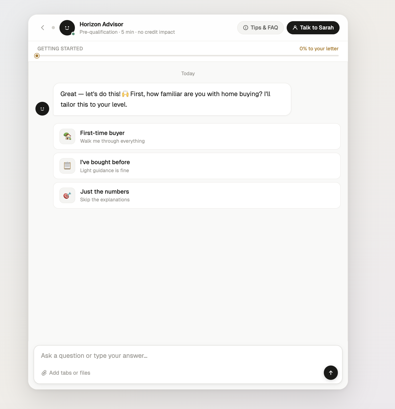
Fig 3 — Adaptive experience question tailors the entire flow
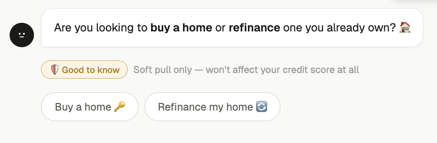
Fig 4 — Contextual education: "Good to know" reduces anxiety mid-flow

Fig 5 — Outcome-framed progress: "10% to your letter" not "Question 2 of 15"
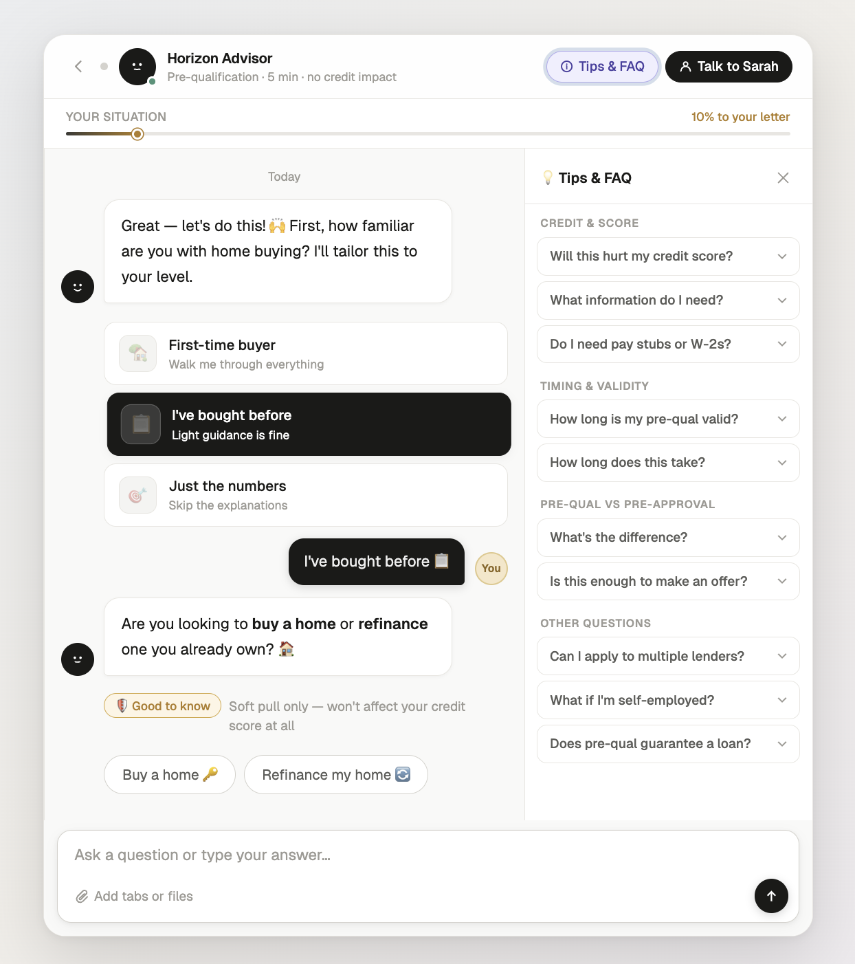
Fig 6 — Full conversation view with Tips & FAQ panel for self-service answers
Key Design Decisions
Every element was redesigned to shift the experience from system-facing to human-facing — making the chatbot feel like a knowledgeable guide, not a data extraction form.
Trust Through Escape Hatches
Users trust AI more when they know they can leave it. The human handoff modal and near-completion momentum are two sides of the same design principle: the user is always in control.
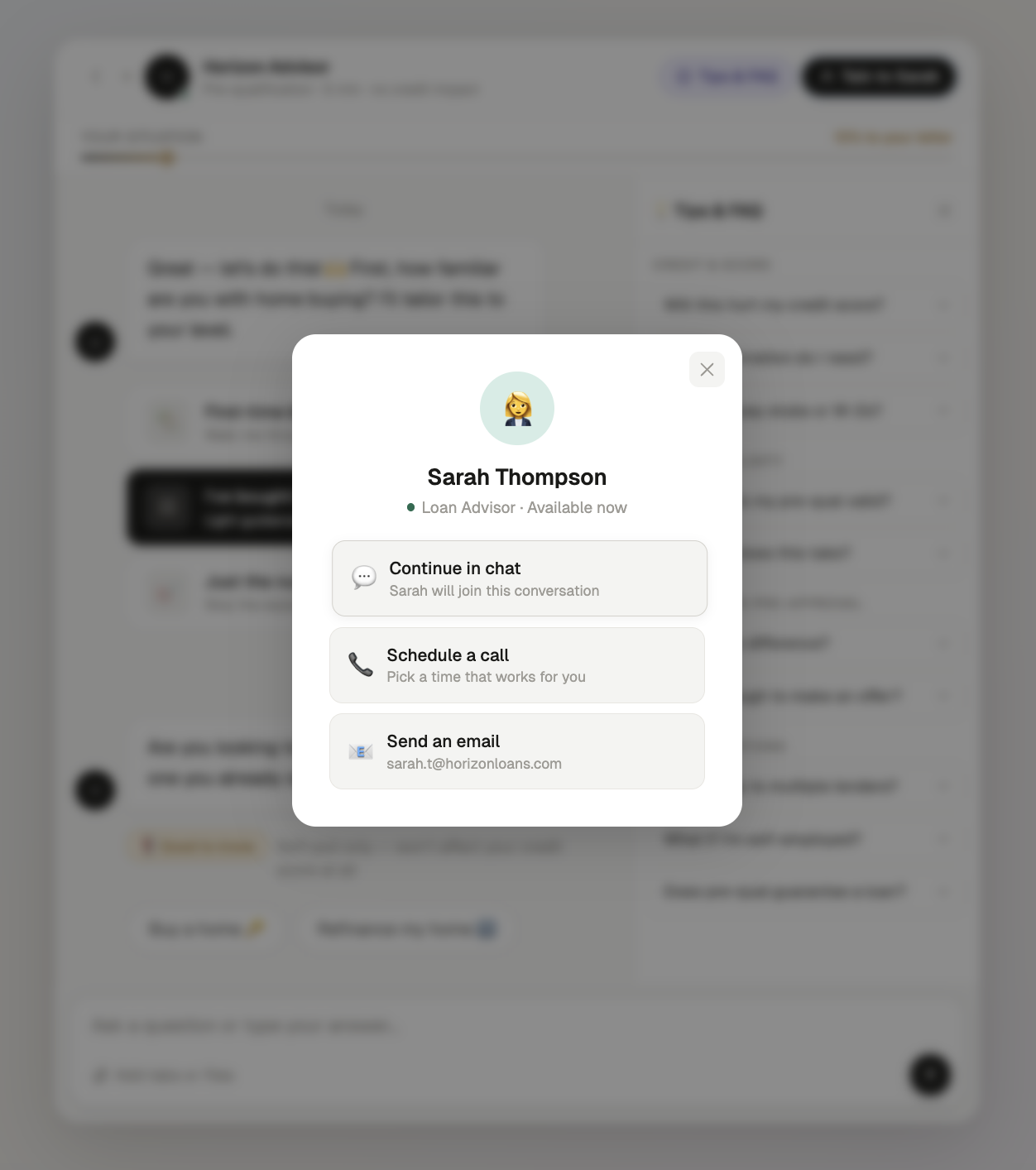
Fig 7 — Human escape hatch: continue in chat, schedule a call, or email
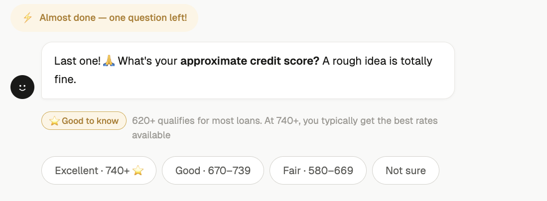
Fig 8 — Near-completion momentum: "Almost done — one question left!"
Completion Strategy: Reducing Prequal Drop-Off
Mortgage prequalification is high-stakes and high-friction — borrowers abandon flows when they feel overwhelmed, confused about what's needed, or unsure where they stand. Traditional form-based prequal has massive drop-off. The chatbot needed to keep borrowers moving forward without pressure.
"Borrowers don't abandon prequal because they lose interest — they abandon because they lose confidence they'll qualify. The chatbot's job is to maintain momentum and clarity."
Step-by-Step Progress
A visible progress bar breaks prequal into clear stages — income, assets, property, review. Borrowers always know where they are and how much is left, reducing the anxiety of an unknown process.
Plain-Language Guidance
"I need your gross monthly income — that's your pay before taxes" — the bot translates mortgage jargon in real time. Borrowers answer confidently instead of second-guessing what's being asked.
Blurred Prequal Letter Preview
The final prequal letter is visible but blurred — loan amount and rate labels showing, details hidden. Just a few questions away. Incompleteness creates completion drive without pressure.
Save & Resume
"Welcome back — you're 80% done. Pick up right where you left off." Borrowers can pause for a pay stub or bank statement and return without restarting. No progress lost, no friction re-entering.
Prequal Milestone System
The progress bar fills toward the borrower's prequal letter with each answer. At key thresholds, the bot responds with encouragement tailored to reduce anxiety and build confidence — especially for first-time buyers who don't know what to expect.
The Payoff: Prequal Letter & Next Steps
The prequal letter is the moment everything was designed around. The $485,000 estimate isn't just a number — it's the culmination of every answer, every trust signal, every "Good to know" moment. But the real design goal is what happens next: the borrower connects with their loan officer, starts preapproval, and enters the consumer portal with the chatbot still at their side. The audit trail gives internal teams full visibility without breaking the conversational experience.
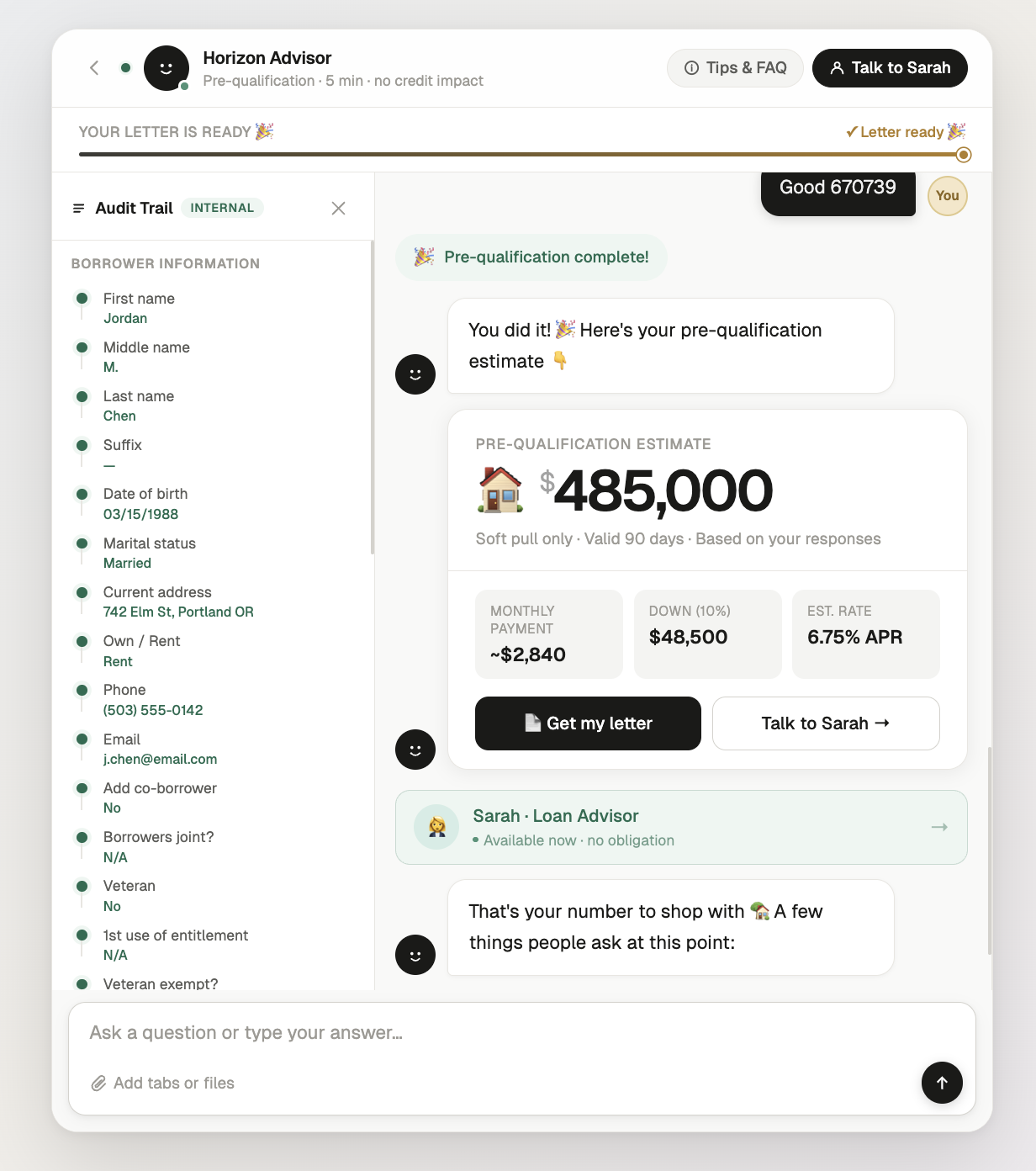
Fig 9 — Full results view: pre-qualification estimate with monthly payment breakdown and internal audit trail
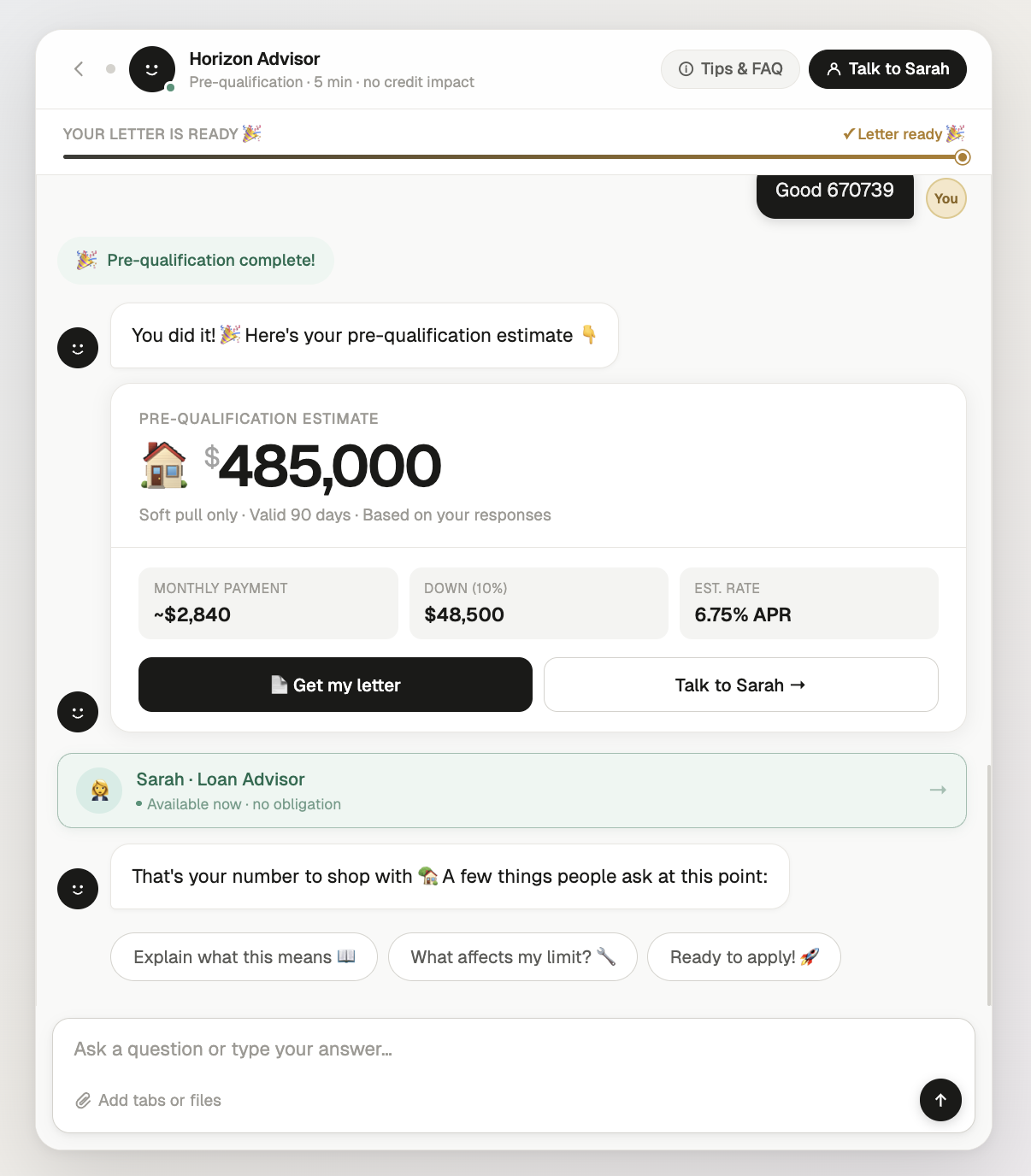
Fig 10 — Results delivery: estimate, monthly payment, down payment, and APR
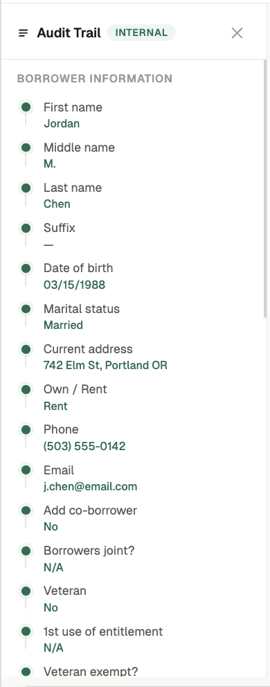
Fig 11 — Internal audit trail: structured borrower data for compliance
White-Label System: Three Brands, One Experience
Because the chatbot lives on each lender's website, it must feel native to their brand — not like a third-party widget. The same screens, interactions, and milestone system were built in three design systems to prove the UX architecture is fully decoupled from visual styling. The design token system means onboarding a new lender's brand is a one-hour configuration, not a rebuild.
Warm Precision
DM Serif Display + DM Sans. Warm off-white background. Teal accent. Gold for milestone moments. 12–16px radius. 1px borders.
Traditional lender — trust-forward, calmFluent 2 — Enterprise
Segoe UI Variable. White surfaces. Purple brand accent. 4–8px radius. Elevation shadows not borders.
Enterprise lender — corporate, polishedDark Mode — Fintech
Inter font. Near-black background. Teal accent. Noise texture overlay. Ambient glow. 10–12px radius. White-at-opacity borders.
Digital-first lender — modern, premiumDesign Principles
Trust Before Data
Lead with the outcome — "Find out what you can afford" — not the process. Show encryption and no-credit-impact signals before the first question. Kill anxiety before it forms. 8 seconds to earn the first answer.
Educate, Don't Interrogate
Every question the bot asks is an opportunity to build confidence. First-time buyers get plain-language explanations. Seasoned buyers get speed. Nobody should feel like they're being tested on mortgage terminology.
One Relationship, Start to Close
The chatbot isn't a prequal tool — it's the borrower's persistent guide. Same voice from first question to closing day. Context carries forward so the borrower never repeats themselves or feels like they're starting over.
Key Takeaways
Conversion to preapproval is determined by how the prequal ends, not how it begins — the handoff moment where the borrower meets their loan officer is the most important screen in the product
Three personas need three different experiences from the same flow — first-time buyers need education, seasoned buyers need speed, and market-navigators need confidence that now is the right time
The white-label token architecture proved that UX can be fully decoupled from visual styling — three lender brands, one experience, one-hour onboarding
A chatbot that disappears after prequal is a missed opportunity — persistence through the entire loan lifecycle turns a lead-gen tool into a relationship builder
What's Next
The working prototype demonstrates the prequal experience across 8 screens and 3 white-label themes. The next phase focuses on the full lifecycle — designing the preapproval transition, the persistent portal experience, and the consumer-facing dashboard where borrowers track conditions, upload documents, and move toward closing with the chatbot as their guide.
Beyond the core flow: persona-specific onboarding paths, loan officer co-pilot features for the lender side, mobile-first responsive layouts, and scaling the white-label system so new lenders can go live with their branded chatbot in hours, not weeks.